Ontarians, at the forefront of financial literacy
Ontario Securities Commission (OSC)
The OSC is Ontario’s capital markets regulator. GetSmarterAboutMoney.ca is its flagship financial education initiative, offering free, unbiased tools, articles, and videos to help Canadians make informed financial decisions.
- Audience Research
- Content Strategy
- Readability Optimization
- Information Architecture & UX Design
- Custom Gutenberg Blocks
- Fully Responsive Design
- Usability Testing
- Iterative QA
The primary goal of the GetSmarterAboutMoney.ca project was to advance the Ontario Securities Commission’s (OSC) mandate of strengthening investor protection. By focusing on human-centered navigation, we sought to create an accessible and intuitive experience for users of all experience levels, particularly newcomers, new investors, and older Canadians. The project also aimed to refine the platform’s content to better support users in building their financial knowledge and making informed decisions, all while ensuring that the design was modernized to improve usability and scalability.
In addition to these user-focused improvements, the Investor Office wanted increased administrator control over the platform’s templates and design elements, allowing for more flexibility while creating a variety of educational content. This flexibility would ensure that updates could be made efficiently without sacrificing design integrity.


Tailored to serve newcomers, emerging investors, and senior Canadians.
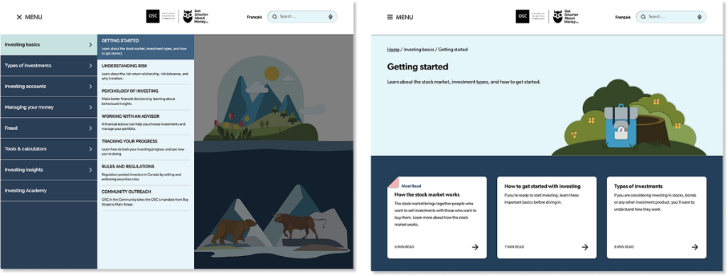
The outdated design of GetSmarterAboutMoney.ca presented limitations in both functionality and user engagement, requiring a complete overhaul to meet modern usability standards. The hub-and-spoke navigation structure further complicated the user journey, making it difficult for visitors to locate the information they needed. The platform also faced challenges related to content management, with a large number of stub articles creating fragmentation and inconsistencies in the educational material. This required a careful consolidation process to ensure the content was both comprehensive and cohesive, without overwhelming the user. The platform’s KPIs were also to be realigned with the OSC’s new strategic plan to provide better performance measurement and ensure that the site’s long-term objectives are consistently met.

Blue Goose kicked off the project by defining major problems as understood by the client. The client identified three major audiences: older Canadians, new investors, and newcomers. The Investor Office had worked with third-party research agencies previously, and our team, including Adam, Sarah, and Moon, reviewed this research to identify gaps in their methodology and inform our research plan.
Audience Study
To ensure a comprehensive understanding of user needs, we partnered with a recruitment agency to assemble over 800 participants that was representative of the Ontario population, geographically and socioeconomically. There was a specific emphasis on recruiting members from historically marginalized communities. Sarah administered the Financial Management Behaviour Scale (FMBS), a gold standard, allowing us to group users by perceived and actual financial knowledge, rather than age or socioeconomic status. This approach allowed us to create more accurate user cohorts and establish a baseline for financial literacy across the targeted audience segments.
Readability Enhancement
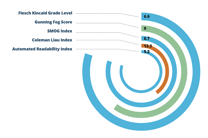
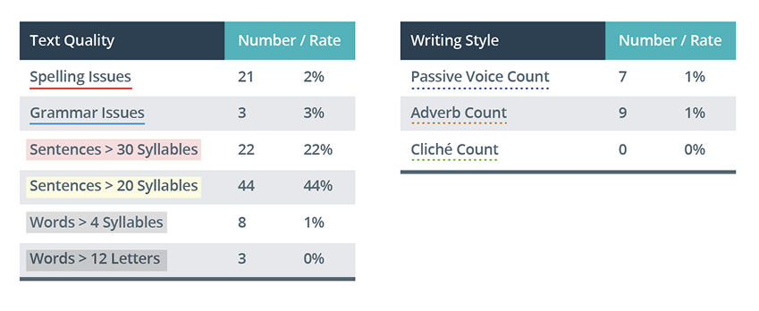
Using the insights gained, we developed a taxonomic model that segmented audiences according to their financial understanding and identified key subgroups. This model served as the foundation for forming hypotheses on information architecture (IA), which led to the design of learning paths and top task journeys. During this process, we conducted a readability assessment on the top 25 articles, presenting the results and documenting the methodology for the client’s content team, who then applied this protocol to the remaining content.
Visual Design
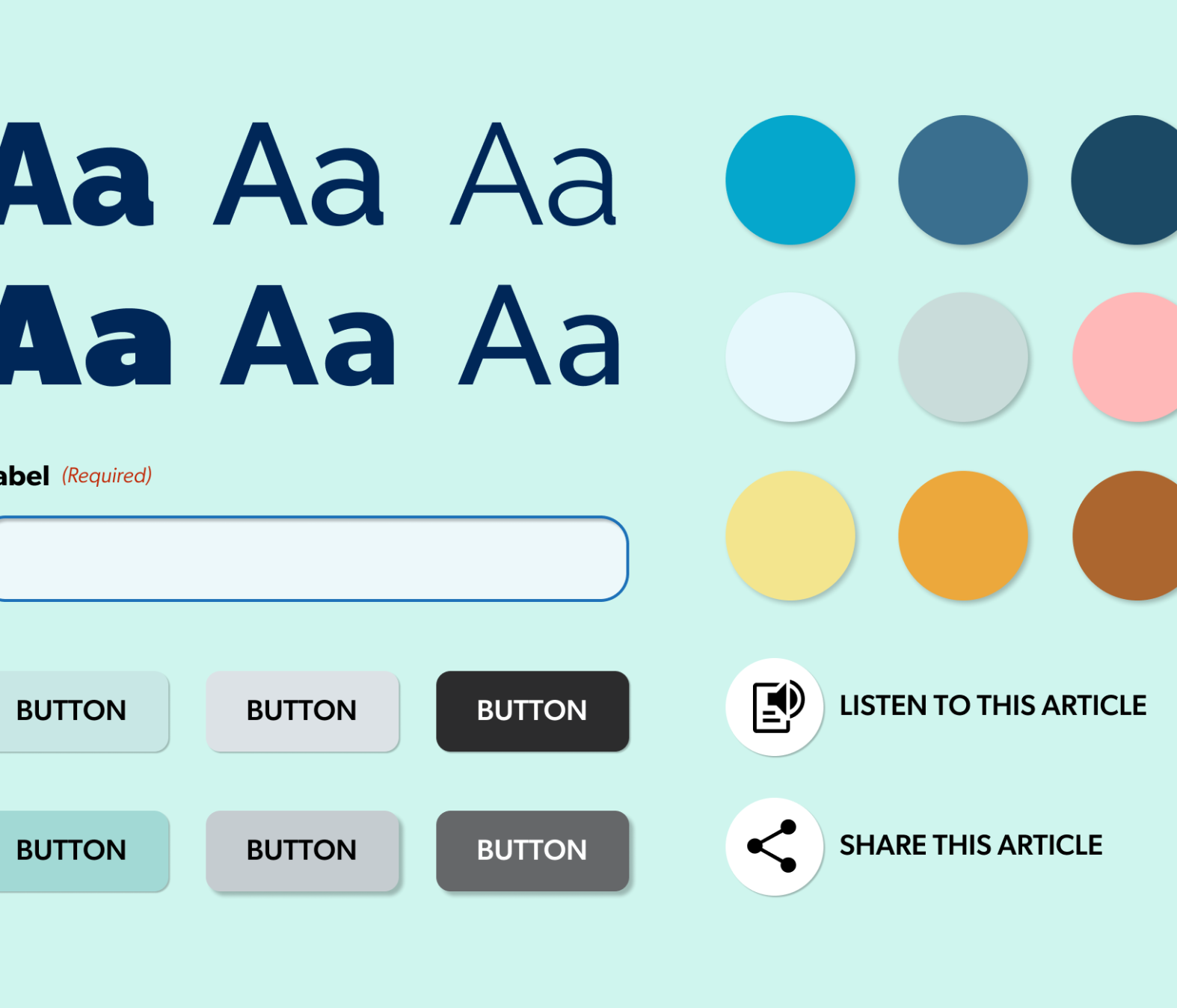
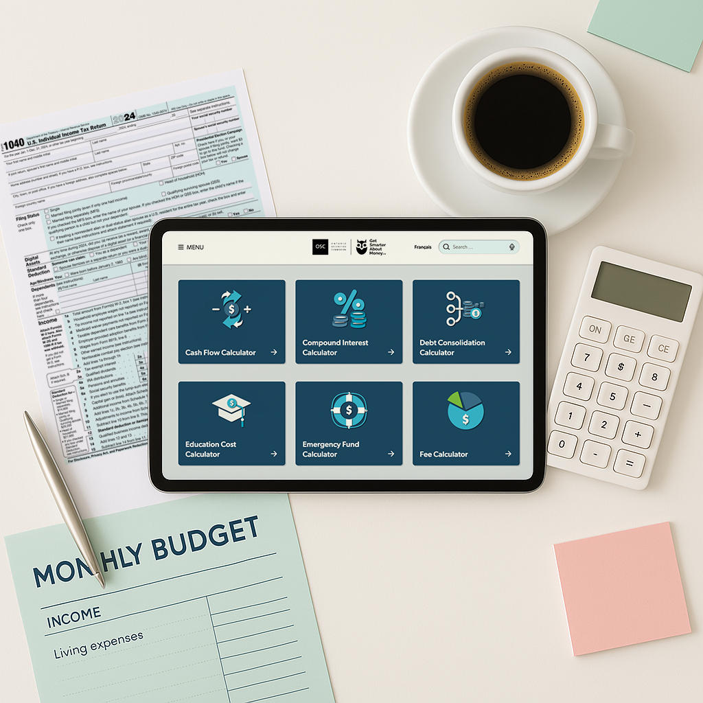
To ensure visual consistency and alignment with brand standards, we created a comprehensive style guide. Our iterative wireframing and visual design process incorporated stakeholder feedback at every stage, leading to a user-centric design that resonated with our target audiences.


Development
Our team developed a Quality Assurance Surveillance Plan, identified key problem statements, and design hypotheses. We then entered an iterative design and development phase, refining the information architecture (IA) and menu structures to better align with the mental models identified during discovery. Throughout the project, we conducted multiple rounds of usability testing, including tree testing exercises. These tests revealed issues with navigation, such as confusing labels and a complex IA hierarchy. By addressing these challenges, we resolved a major issue where the organization had labeled menus with jargon instead of terms that visitors would find intuitive.
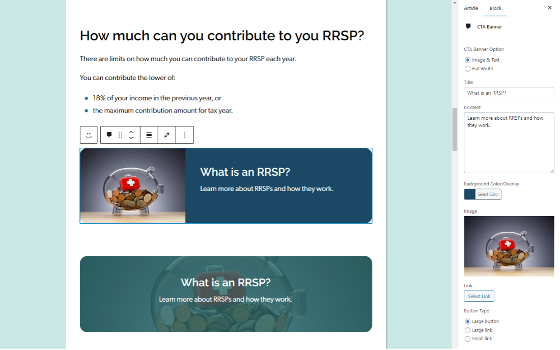
To address the challenge of content editors struggling to visualize how content would appear on the frontend, we designed and developed custom React Gutenberg blocks. This facilitated a far easier and efficient editing experience where content could be directly edited in the backend as it would appear on the frontend for all devices. By customizing the editor using React hooks, we were able to lock templates, ensuring consistency across hundreds of pages, significantly reducing the administration time associated with the website.
We recognized that many users were discovering articles on GetSmarterAboutMoney.ca through Google search, so we set out to enhance their experience by helping them dive deeper into the topics they were interested in. To achieve this, we implemented several UI and usability features aimed at boosting engagement, including:
- Displaying reading time on listing pages for better time management
- Organizing all articles within a learning path in a collapsible right-hand column for easy navigation
- Using checkmarks to indicate when a page has been fully read.
- The system remembers progress without requiring users to log in
- Adding clickable tags that lead to listing pages with all related content
- Including an on-page glossary to make understanding jargon easier
Our target audiences—newcomers, new investors, and older Canadians—led us to prioritize making all content accessible to the general population. To ensure this, we conducted a readability study using the Flesch-Kincaid scale and focused on rewriting the top 50 most popular articles, which made up 80% of the site’s content, to a grade 6-8 reading level.
We also recognized that users typically visit the site during office hours, likely feeling stressed or distracted. By writing in plainer language, we aimed to make it easier for them to absorb key information quickly, even when their focus might be divided.
The redesigned site significantly improved user engagement, evidenced by a higher number of unique page views per session. Users arriving via Google search are now more likely to explore additional content. Our revised navigation led to a 35% increase in task completion, meaning users can now find what they’re looking for in the menu structure much more easily. Additionally, they are completing tasks about 20% faster. User confidence, based on qualitative feedback, was overwhelmingly positive.
